Bentley Unveils New Logo Ahead of July 8 Concept Car Debut
Led by Design Director Robin Page, Bentley’s in-house team created the logo’s fifth redesign in the brand’s 106-year history.
By Reetika Bhatt

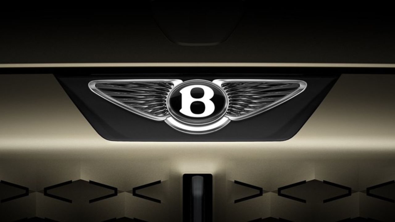
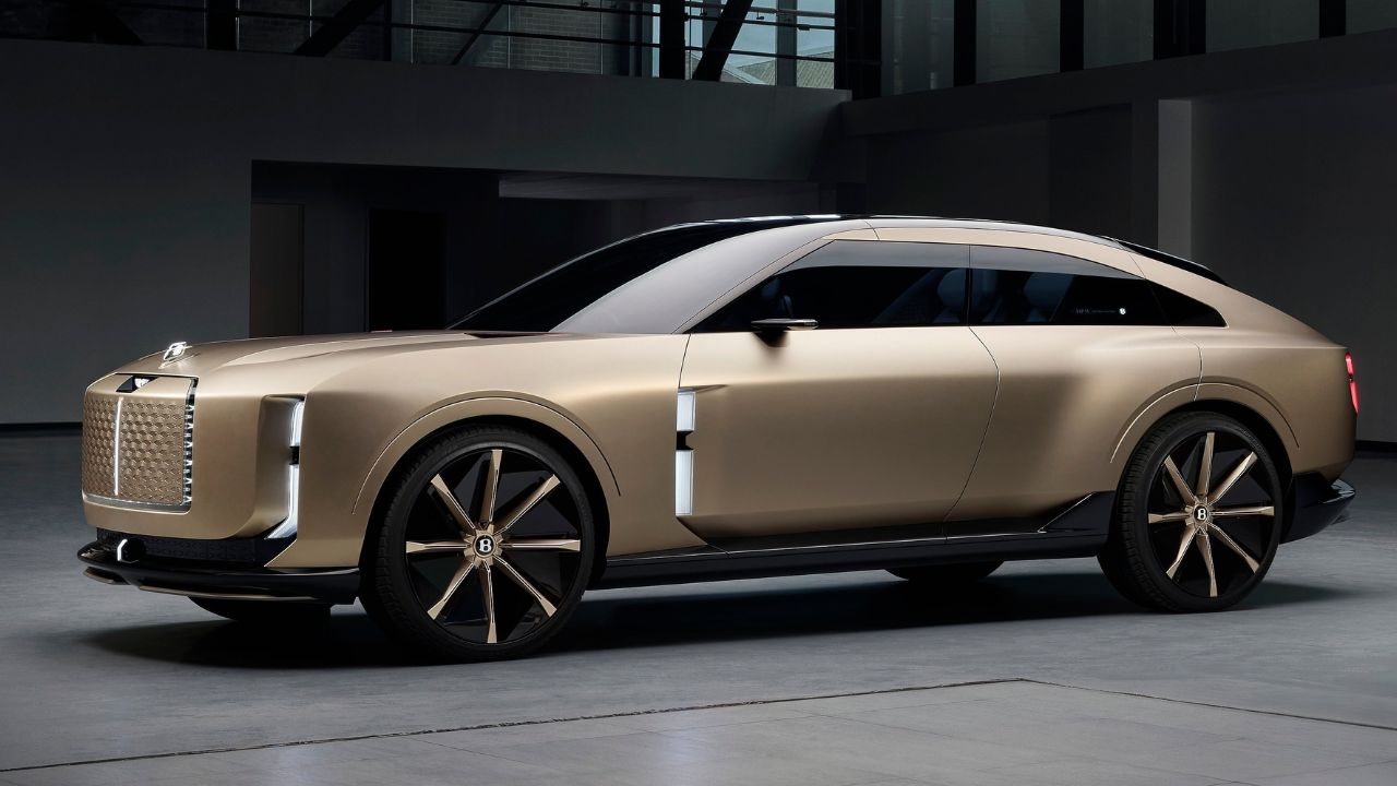
Bentley has debuted a thoroughly updated version of its iconic “Winged B” logo – the brand’s first major visual overhaul in more than 20 years. Unveiled in the lead-up to the company’s forthcoming concept car reveal on July 8, the new emblem adopts a sharper, more sculpted form with angular wings inspired by the Peregrine Falcon. The central “B” has been refined for a more jewel-like appearance, while the absence of the lower feather elements lends a cleaner, modern edge. Designed entirely by Bentley’s in-house team under Design Director Robin Page, this redesign represents only the fifth iteration of the logo in the marque’s 106-year history. The updated badge will make its debut on a future-focused concept vehicle at the opening of Bentley’s new Crewe-based Design Studio.
The New Logo: Key Details
Bentley’s updated Winged B logo was developed under the direction of Robin Page, with the final concept originating from Young Nam of the Interior Design team after a company-wide design challenge. The objective was to reinterpret classic features – like the diamond wing texture and central ‘B’ – into a cleaner, more future-facing form.
Also Read: Bentley Bentayga Speed Globally Revealed with 641bhp V8 Power Engine
The wings have been completely reshaped with sharper, falcon-inspired lines, replacing the softer contours of the previous emblem. To enhance visual simplicity, the feather details beneath the ‘B’ were removed. The central badge has also been reworked to echo the precision and elegance of fine watchmaking, incorporating a beveled glass top, chamfered metallic border, and a recessed 3D 'B'. This new centerpiece is designed to function independently as a modern brand symbol.
Evolution of the Logo
Bentley’s logo has always centered around a winged ‘B’, a symbol of speed and performance. The original version was created in 1919 by renowned automotive illustrator F. Gordon Crosby, who captured W.O. Bentley’s vision and background in aircraft engine design. To make it harder to replicate, Crosby gave each wing a different number of feathers.
In 1931, after Bentley was acquired by Rolls-Royce, the emblem was redesigned with a more formal and symmetrical look – 10 feathers on both sides and a simplified ‘B’ set in a black oval. This version remained unchanged for decades.
Also Read: Bentley Batur Convertible Revealed Globally with a Massive 6.0-Litre W12 Engine
A more stylised take arrived in the mid-1990s, reviving the original’s character. Later, Volkswagen introduced a new asymmetric design for the 2002 Continental GT, featuring 10 feathers on the left and 11 on the right – an identity that defined modern Bentley models.
-1769883960084.webp)


